Latest Event Updates
WordPress Version 3.8 Released on 12 December 2013
On December 12, 2013, WordPress Version 3.8, named for Charlie Parker, was released to the public. For more information on this enhancement and bug-fix release, read the WordPress Blog, the Release Post, and see the Changelog for 3.8.
For Version 3.8, the database version (db_version in wp_options) changed to 26691, and the Trac revision was r26861.
Highlights
- Introduces a new, modern admin design
- A fresh, uncluttered design
- Clean typography with Open Sans
- Superior contrast and large, comfortable type
- Responsive interfaces throughout
- Refined, theme management
- Smoother, click-to-add widget management
- New Default Theme – Twenty Fourteen
- Easily create a responsive magazine website with a sleek, modern design.
- Feature your favorite homepage content in either a grid or a slider.
- Use the three widget areas to customize your website, and change your content’s layout with a full-width page template and a contributor page to show off your authors.
- For Developers
- External Libraries have been updated.
- Better RTL support
- Theme screenshots’ size have increased from 600 × 450 to 880 × 660.
What’s New
GENERAL
- Replace PNG-based plugins ratings stars with Dashicons for performance gains
- Improved help tab text in various screens
- Clicking “Check Again” on the Updates screen now provides more immediate feedback
DASHBOARD
- Consolidate several Dashboard widgets to improve readability
- Replace the ‘Right Now’ widget with the new and improved ‘At a Glance’ widget
APPEARANCE
- Introduce 8 new admin color schemes
- Improved readability throughout using Open Sans typeface (where supported)
- Responsive Toolbar for smaller-screen devices
- Leverage Dashicons instead of icon sprites for crisper experience on all resolutions
- Big RTL improvements throughout
- Make the dashboard more usable on any size device with responsive all the things
- Improve the login screen experience for Internet Explorer 8 users
- Improve Quick Edit experience for non-English users
- Improve the Menus experience for mobile users
THEMES
- New Default Theme — Twenty Fourteen
- Make it possible to check for any post format assigned to a post with has_post_format()
- Better custom background theme support defaults, can now specify ‘default-repeat’, ‘default-position-x’, and ‘default-attachment’ arguments for background images.
- Tags for width changed to layout: responsive-layout, fluid-layout, and fixed-layout
- New tag: accessibility-ready to denote a theme is aware of accessibility best practices such as color contrast, keyboard navigation, and form/link focus. See WP theme accessibility guidelines.
WIDGETS
- New click-to-add interface for adding widgets to sidebars
- Improved interface for devices of all resolutions
- Better drag-and-drop experience
ACCESSIBILITY
- Make list table row actions keyboard accessible
- Improve color contrast throughout the admin
MULTISITE
- Improved performance when deleting users in Multisite
Under The Hood
GENERAL
- Heartbeat performance and API improvements
- A $taxonomy argument was added to each of the adjacent post functions.
- Define $is_nginx in vars.php
- Apply capital_P_dangit() to the wp_title filter
- Make sure ajaxurl is defined in the Customizer
- validate_active_plugins() now checks the manage_network_plugins capability instead of is_super_admin()
- Add a show_metabox parameter to register_taxonomy()
- Make it easier to target video shortcodes by adding a wp-video class to the parent container
- Add CSSMin, SASS, CSSJanus, and jsHint to build tools for core development
BUG FIXES
- Fix bug where top-level categories were only redirecting if they had no children
- Fix bug in wp_get_object_terms() where returned were strings not integers
- Fix a bug where passing a null value to meta_query resulted in wonkiness with the comparison operator
- Fix “‘wp_signups’ already exists for query” error after updating a Multisite network
- Fix bug in get_bookmarks() caused by missing parentheses
- Fix comment_notification_recipients filter behavior so that it is still respected even on comments left by the post author
- Fix a date comparison error in dashboard_relative_date()
- Fix keyboard accessibility for row actions in list tables.
- Fix no-js and accessibility modes in in the Widgets screen
- Fix a bug where menus could still be assigned to a non-existent theme location
- Silence jQuery Migrate errors in the General settings page
MULTISITE
CLASSES
- Introduce WP_Screen::remove_option()
- Introduce WP_Screen::remove_options()
- Introduce WP_Screen::get_options()
FUNCTIONS
- Introduce wp_dashboard_quick_press()
- Introduce wp_dashboard_site_activity()
- Introduce wp_dashboard_recent_posts()
- Introduce wp_dashboard_recent_comments()
- Introduce wp_dashboard_primary_output()
- Introduce wp_heartbeat_set_suspension()
- Introduce wp_star_rating()
- Introduce get_theme_update_available()
- Introduce wp_prepare_themes_for_js()
ACTIONS & FILTERS
Actions
- Introduce automatic_updates_complete
Filters
- Introduce automatic_updates_debug_email
- Introduce wp_prepare_themes_for_js
EXTERNAL LIBRARIES
- Add a copyright notice to zxcvbn (password strength meter) script
DEPRECATED
- screen_icon()
- get_screen_icon()
- wp_dashboard_incoming_links_output()
- wp_dashboard_secondary_output()
- wp_dashboard_incoming_links()
- wp_dashboard_incoming_links_control()
- wp_dashboard_plugins()
- wp_dashboard_primary_control()
- wp_dashboard_recent_comments_control()
- wp_dashboard_secondary()
- wp_dashboard_secondary_control()
- no_update_actions()
MISCELLANEOUS
- Many unused images were removed from core. See the full list
Google AdWords Benefits and Failings
 Google AdWords is an advertising service that may be an effective choice in some circumstances. However, in many situations, it will be money wasted and the company using the service will actually end up worse of than had they not used the service at all.
The AdWords services will present one or a few ads at the top of Google search results. If you’ve been unable to naturally (“organically”) reach the top of search results, AdWords may be a short-term solution. However, it’s an expensive alternative to having a well designed website with rich and abundant quality content. With AdWords, one becomes reliant upon paid traffic instead of getting a natural flow of visitors to their website.
The way AdWords works is that you pay for having positioning at the top of search results for specific searches.
The most cleverly and effectively crafted AdWords campaign will be based upon an exceptional knowledge of what people might be searching for, and for that search, paying to be at the top of the page. However, a website properly designed can produce similar results.
Below is an example of how AdWords can work and also fail for certain advertising campaigns. In this example, some people have paid to have an ad placed at the top of the page when a search is conducted for “iowa city web design” (without quotes). One of the businesses that paid for AdWords is naturally in the #4 position anyway, so they have paid money for nothing. In addition, for advertising fees based on clicks, the business will actually pay for visitors coming to their site rather than getting free visits to the site. The #2 position was attained without any advertising.
Google AdWords Example
WordPress Twenty Ten Theme – Adjust Space Above and Below Site Header
When using the WordPress Twenty Ten theme (for those not hosted on WordPress.com), it is desirable to remove the site header text that displays the site title and tagline at the top of the page. This conserves space and allow for a more artistic presentation of the site.
After removing the header title and tagline, the gap at the top of the page will be noticeable. To save page space, it’s a good idea to reduce this margin of white space at the top of the page above the header. To balance the narrower top margin, a smaller margin below the header image and navigation menu is needed.
Follow these instructions to adjust the margin of space above and below the page header image. [More…]
WordPress Twenty Ten Theme – Remove Site Header Text for Title and Tagline
When using the WordPress Twenty Ten theme (for those not hosted on WordPress.com), it is desirable to remove the site header text that displays the site title and tagline at the top of the page. This conserves space and allow for a more artistic presentation of the site.
Using a child theme helps retain your modifications even after parent theme updates have been installed. However, some users may be reluctant to use child themes for just a few minor changes that are easily repeated later.
Here are the instructions for removing the site header title and tagline from WordPress Twenty Ten. [More…]
University of Iowa – Language Media Center Website – Site Content Writer
 I first took on responsibility for the website of the Language Media Center (LMC) at the University of Iowa in 2001.
At that time, like most websites, site pages were designed with basic HTML using Dreamweaver and the site was mostly a static reference.
In 2011, the University of Iowa began the process of migrating all administrative and departmental websites over to a content management system (CMS). A few options were considered, but eventually Drupal was chosen as the platform to build upon. Enterprise-wide standardization of layout and design centralized and reduced the workload of those responsible for website management. This shift in focus resulted in more time and energy being spent on site content. [More…]
BringTim.com Website Designed by Small Dot Studios and Inertia Unlimited
Site Review by Greg Johnson
BringTim.com is a collaborative success made possible by the design geniuses at Small Dot Studios who teamed up with photography alchemist and web creation guru Bill Adams of Inertia Unlimited.
The site (shown below) is an excellent example of the synergy, creativity, and efficiency that can happen when design and development teams work together.
Below is a review of the site that explores the exceptional design characteristics as well as some areas that could be improved.
It’s well known that budget constraints and the desires of a client can influence the ultimate outcome of site design. So, suggestions for improvement are not a reflection of the designers, but simply a commentary about website design in general.
Click the site image below to visit now.
Graphics & Images. What strikes me immediately as I visit the site are the clean bold graphics. The main landing page is a critical part of any website. It’s like a resume. You really need to make a good first impression and convey the basic information people need to know. BringTim.com accomplishes this with elegant and professional graphics.
Navigation. Sites that overwhelm people with links, banners, and too many navigation options are likely to repel visitors rather than draw them in. An excellent design aspect of BringTim.com is that the top navigation bar is clean and simplistic — providing all that’s needed and nothing that isn’t.
Video. The video set to auto play is an effective way to engage site visitors immediately upon arrival, and it’s well done — which is essential. If a picture is worth a thousand words, a video is worth a million. Yet, some photos and videos just mumble and don’t communicate effectively.
Media. The list of media coverage for the product is amazing.
Possible Improvements. These are a few areas I noticed that could use improvement:
- Layout. In an otherwise perfect site, I noticed that the text layout there’s an odd problem with the font layout for the heading “World’s First Meeting Cost Calculator & Clock” above the product to the left of the video. The text isn’t centered in the area above the product and it almost runs into the gray area above the video. On the Boss Gift page, this isn’t a problem. This really isn’t a usability issue, and most people would not even notice it as a design problem, but it caught my eye.
- Purchase. It would be nice to have a simple embedded shopping cart option on the website. Instead, the “Buy it Now” link abruptly leaves the site and opens a product page at http://victorystore80.stores.yahoo and unfortunately that Yahoo store doesn’t have the same design elegance as the BringTim.com site. It would help if the store were designed a little better to match the site. Or, if the site visitor were clicking on a link that said, “Purchase from our merchant partner” or something like that.
- Recommendation. I’d recommend selling the product through multiple online stores such as eBay, Amazon, and Yahoo’s main shopping portal. This will give the product more exposure and allow site visitors to purchase through their preferred store. For example, Amazon Prime members will likely want to purchase it from Amazon. Considering that the product has had some major national media exposure, it would really be worth it to style-up the selling process.
- Contact. The Contact link brings up a cool window and shades the site. However, there’s a lot of information put in that small window, so scrolling is required. It seems a small pop-up window would be better reserved for times when you want to display a small amount of information. Also, missing is a feedback form. This could include a captcha verification process to help reduce spam.
- Recommendation. I’d recommend simply using a web page as the contact page. Include the contact information as well as a feedback form. Many sites include essential contact information (like the phone number for ordering) prominently located in the header of the site or right column area.
DPO Construction Website for Don Otto by Iowa City Web Design Artist Greg Johnson
 Most websites are created as a joint effort between the site designer and the client. Some clients simply say, “Make me a site” and give the designer full-reign over the language and graphics.
However, it’s more typical for a client to have specific requests and requirements for the site design, especially when it comes to what’s written on the website and what photos are used.
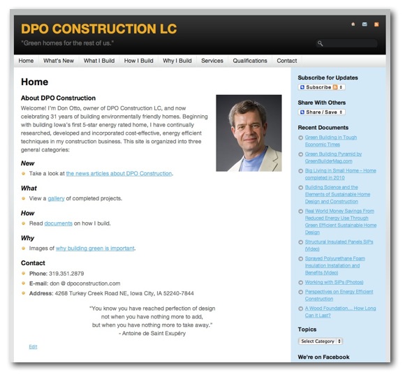
In making the DPO Construction website for Don Otto, the goal was convey and emphasize green and sustainable architecture and construction.
I enjoyed working with Don because he was able to easily draw from his experience and knowledge of architectural beauty and function to assist in the process of building his website. It told me a lot about how he builds homes.
Click the website image below to visit the site.
Hello world!… Iowa City Website Developers Launch, Goals, Design, and SEO
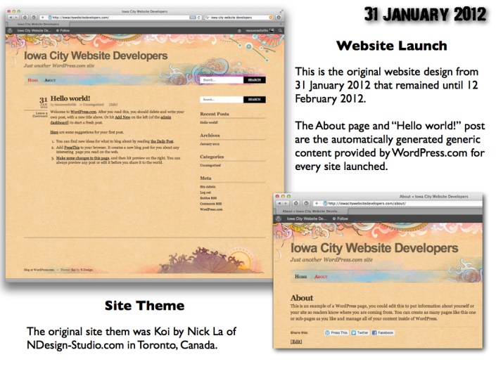
Launch. This site was launched on 31 January 2012 using WordPress.com services for hosing and domain name registration.
Goals. The primary goal of this site is to showcase and promote local Iowa City web developers and their work. Additional articles will be provided to discuss web development related topics.
Design. The initial theme assigned to this site was Koi by Nick La of NDesign-Studio.com based in Toronto, Canada. It’s an attractive theme, and may be retained for a while. Theme and design changes will be announced with previous themes retained as screen shots in archives to show the progression of the site over time.
Click the image below to view in full size (1024×768) resolution.
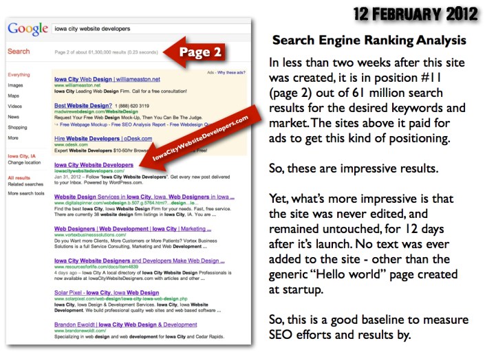
Search Engine Ranking Analysis. In less than two weeks, by 12 February 2012, the site had reached position #11 for the desired keywords and market (as explained below) — without having invested any time in the site during or since launch. In the months ahead, some organic promotion and SEO efforts will be made to give the site better exposure.
Click the image below to view in full size (1024×768) resolution.


